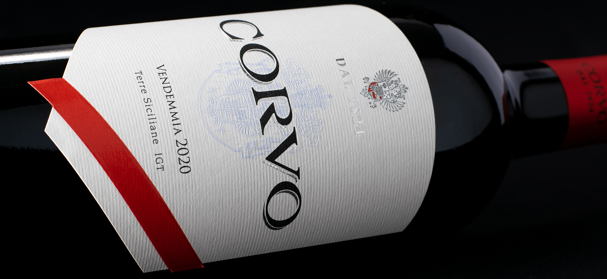
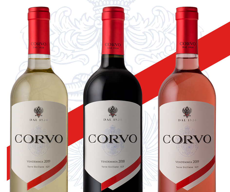
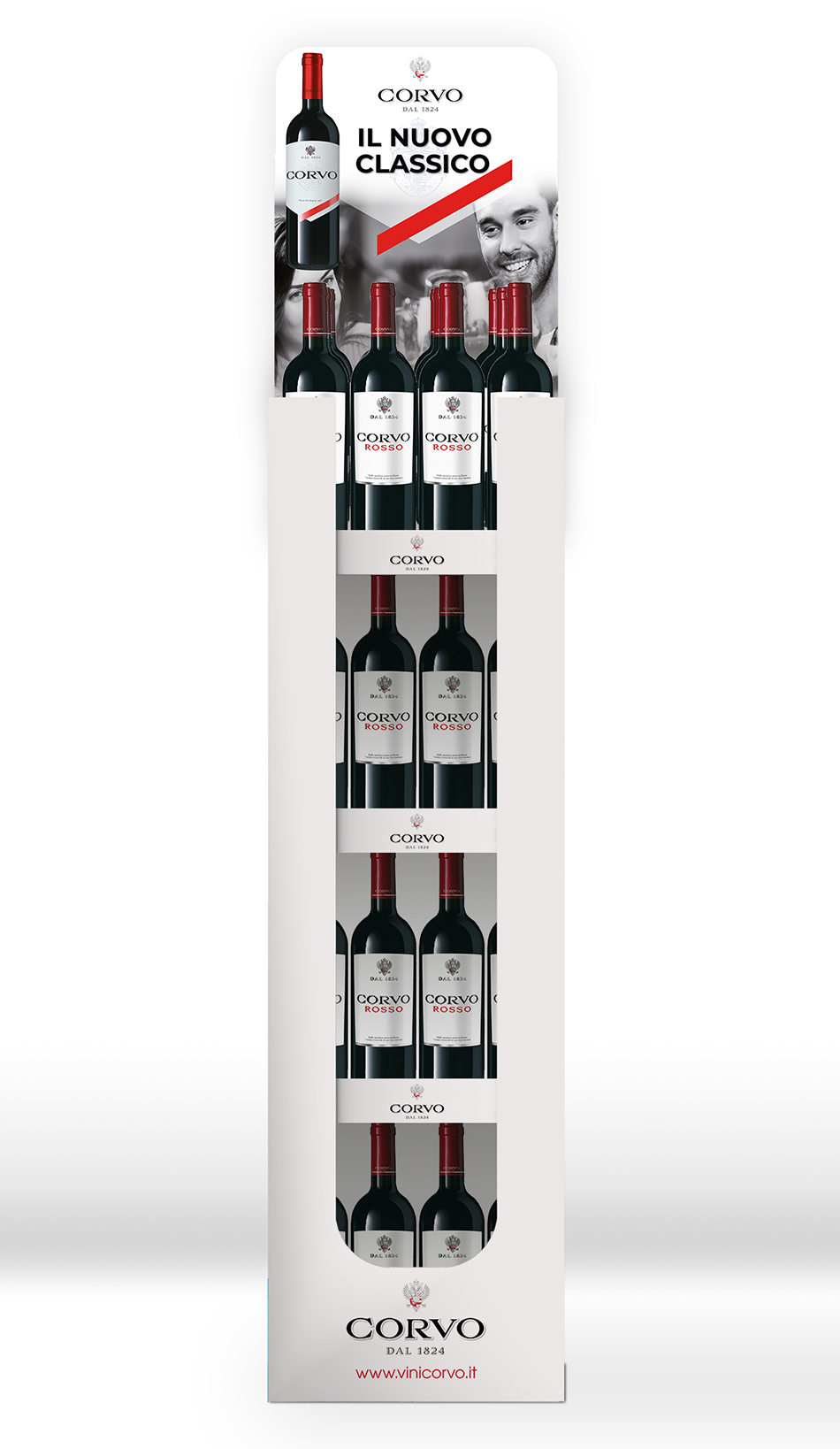
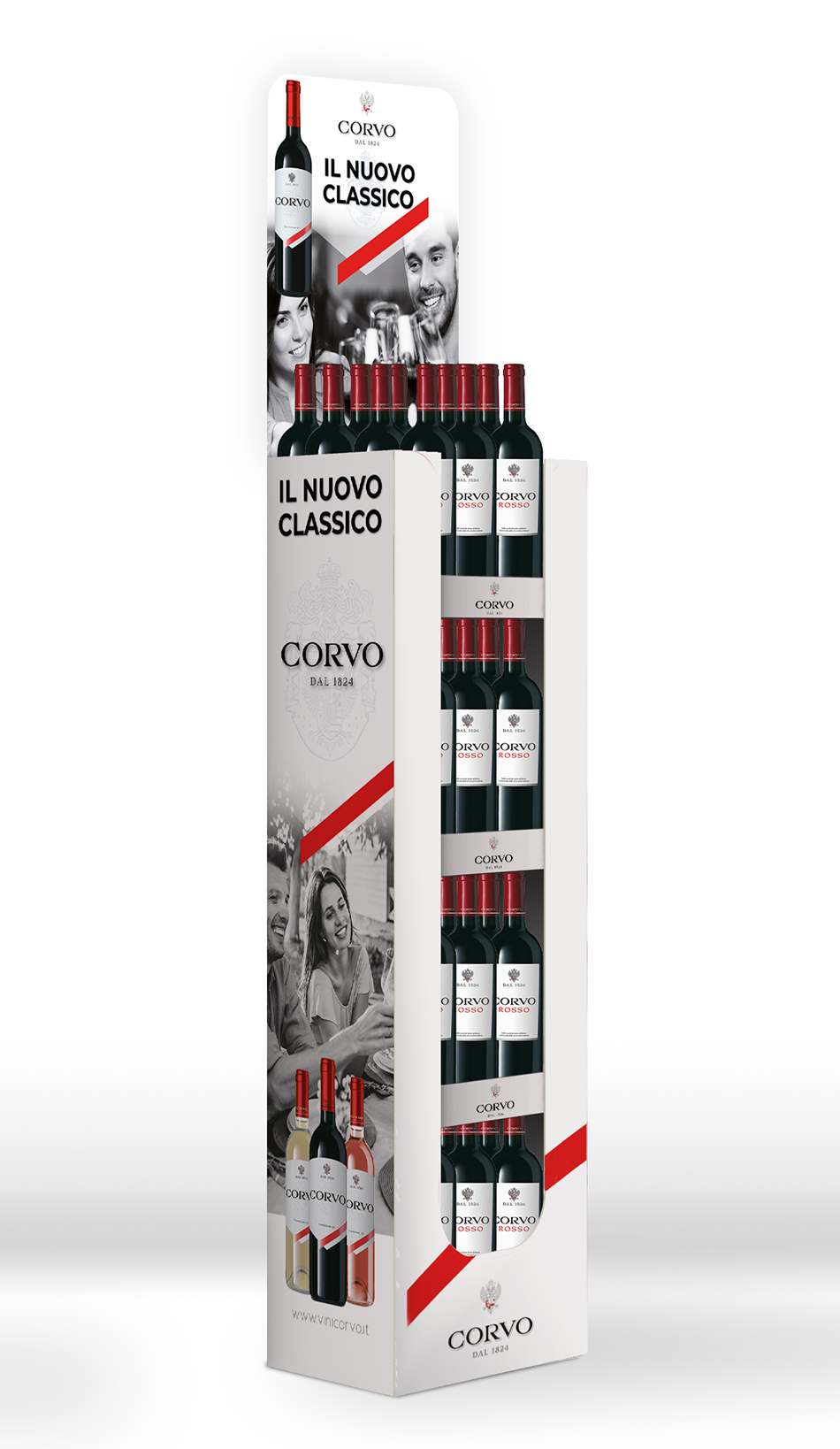
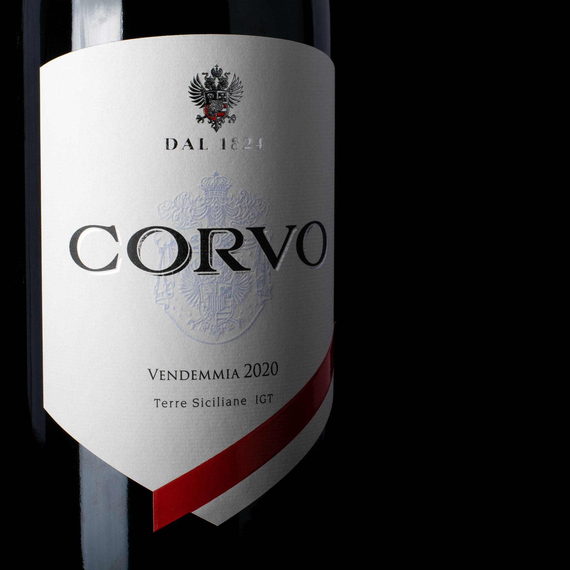
The Corvo Brand began in 1824. From that moment it has been enjoyed worldwide. It brings the history of our own country, onto Italian tables. This was the main driving point to our restyling of this historic wine brand. This wine is a great companion to intimate evenings among friends and family, a wine that sinks its roots into our Italian traditions.
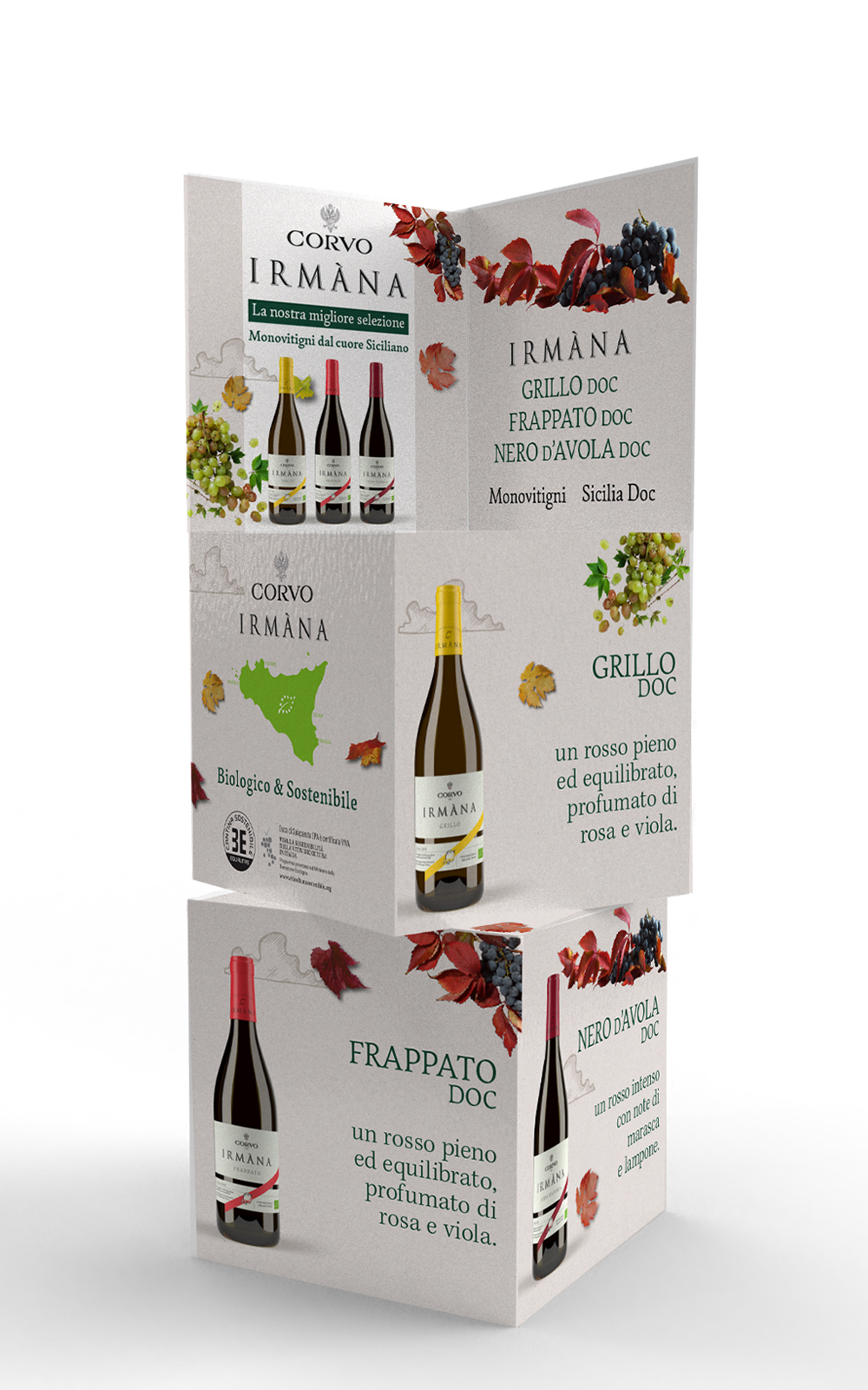
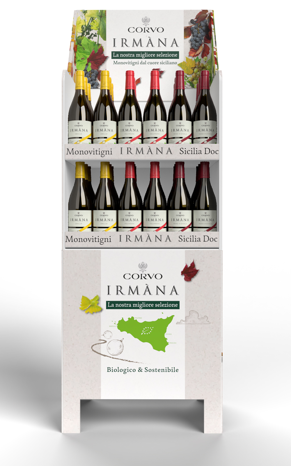
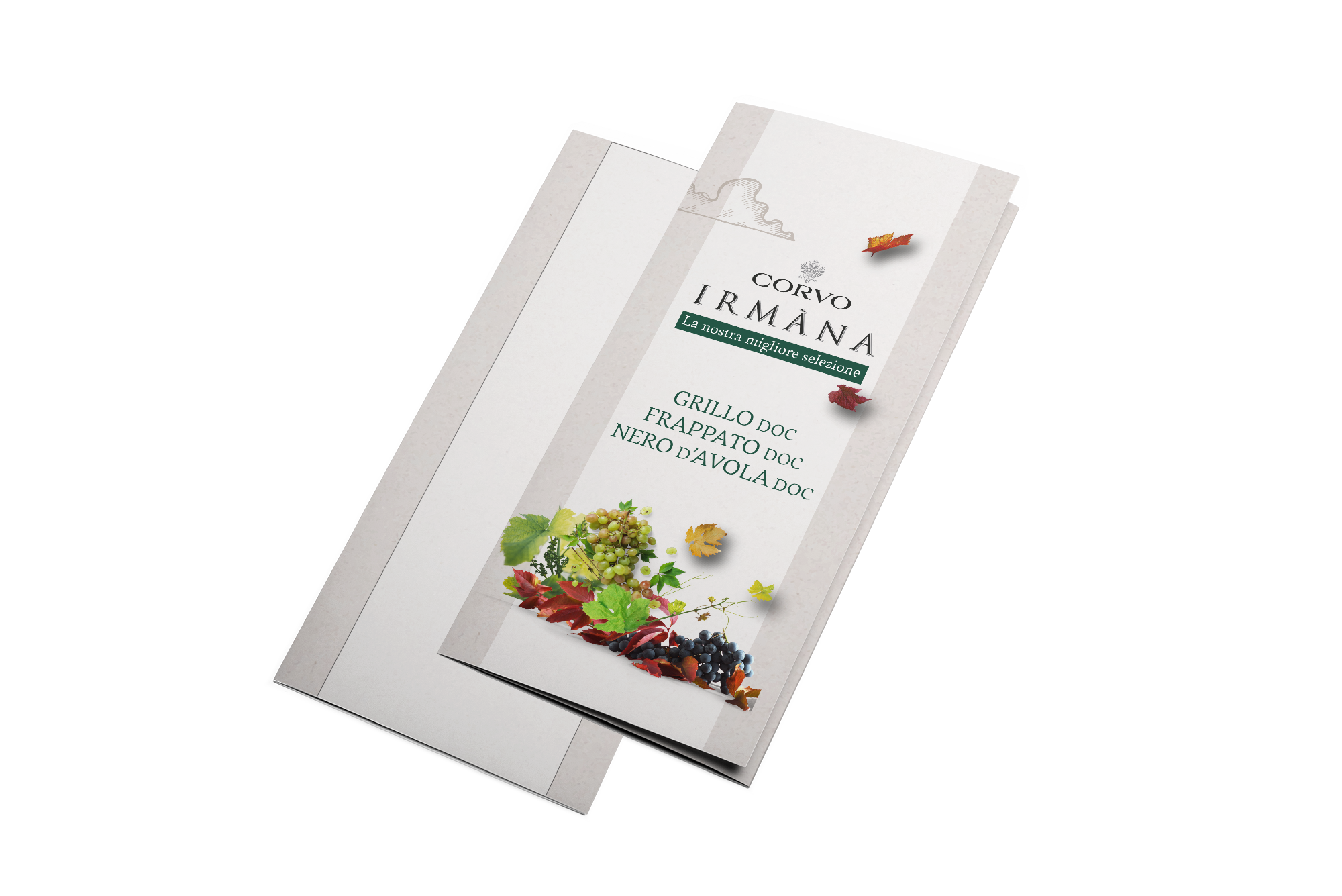
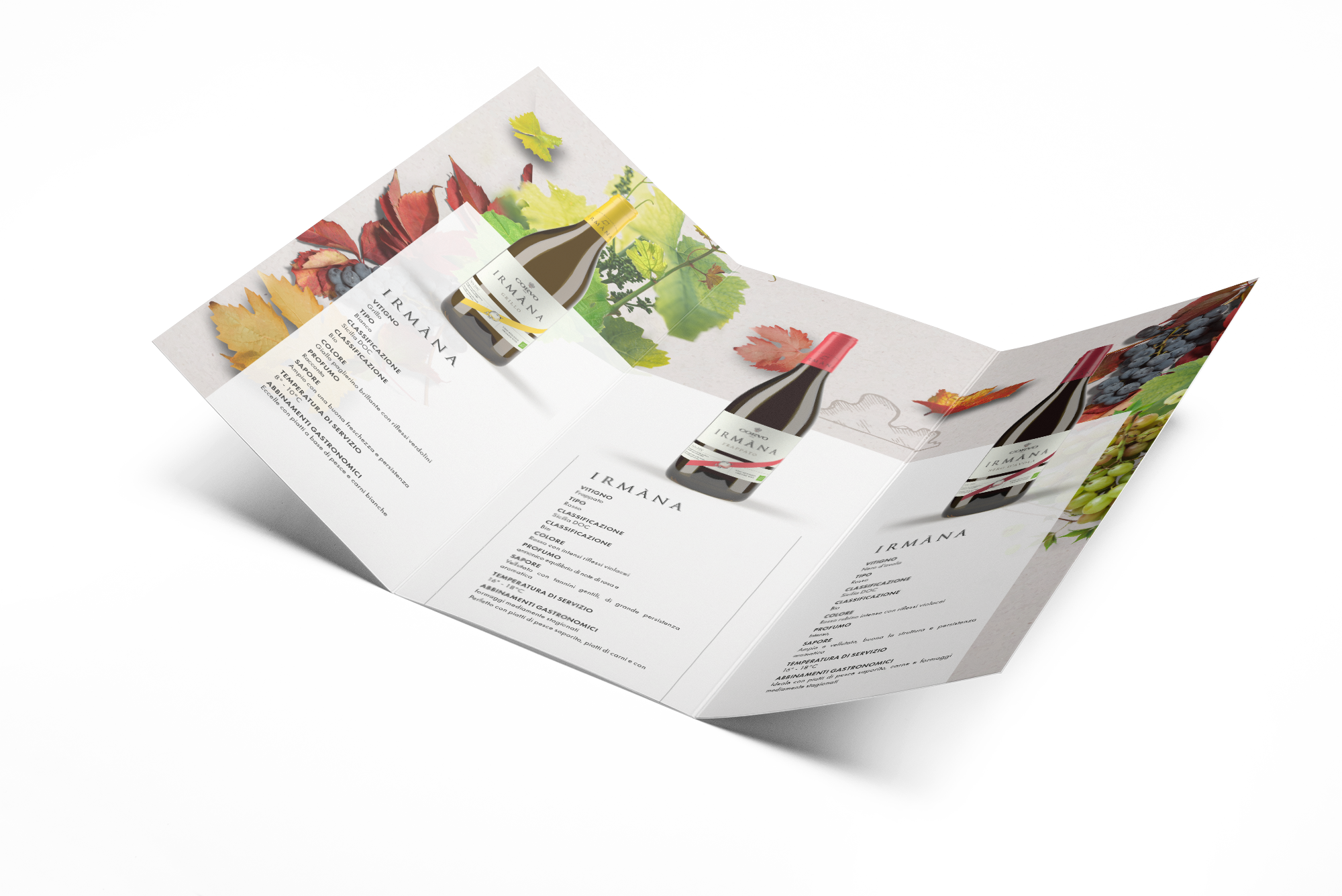
With the birth of this rebranding we developed a full declination for all promotional communications along with presentations for special occasions.


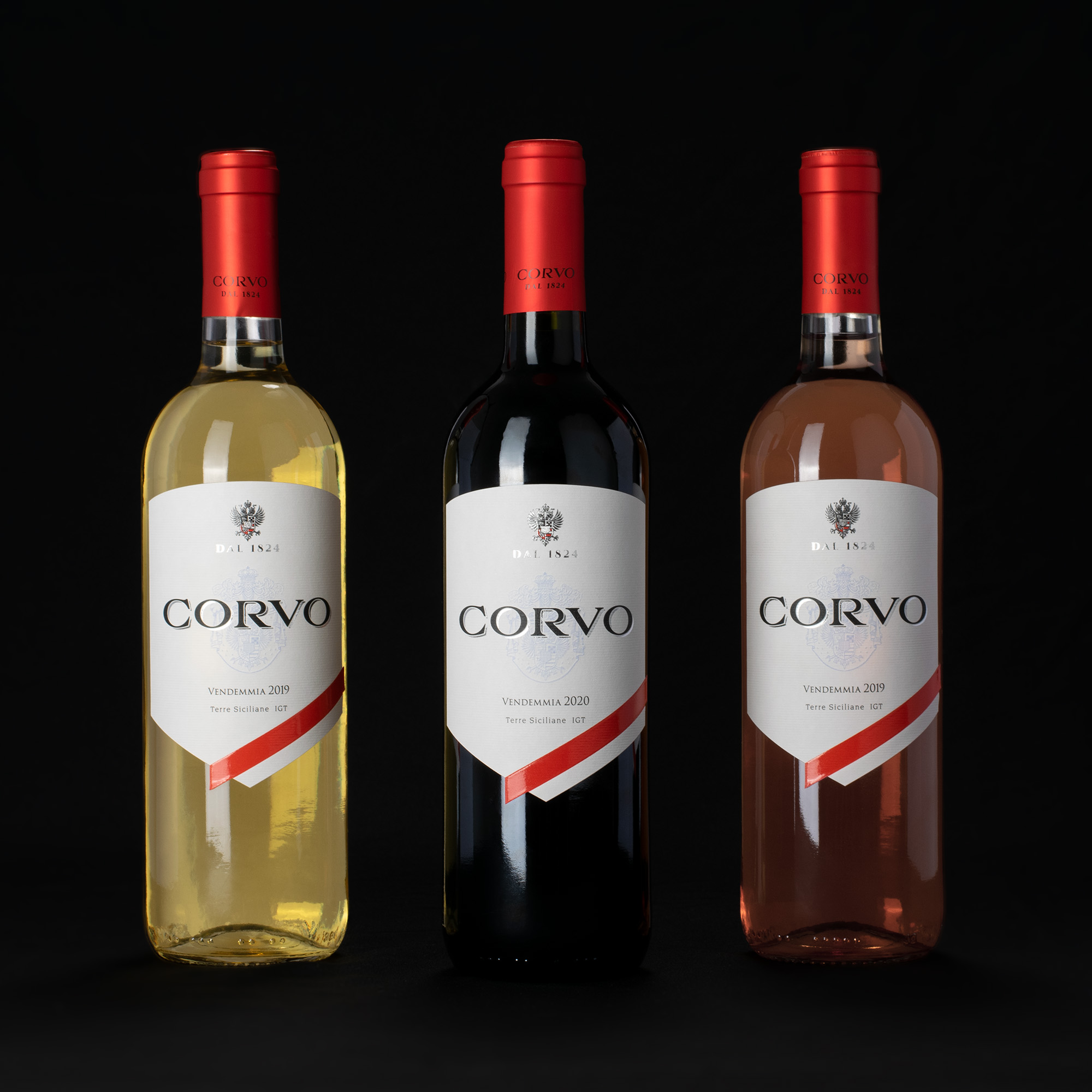

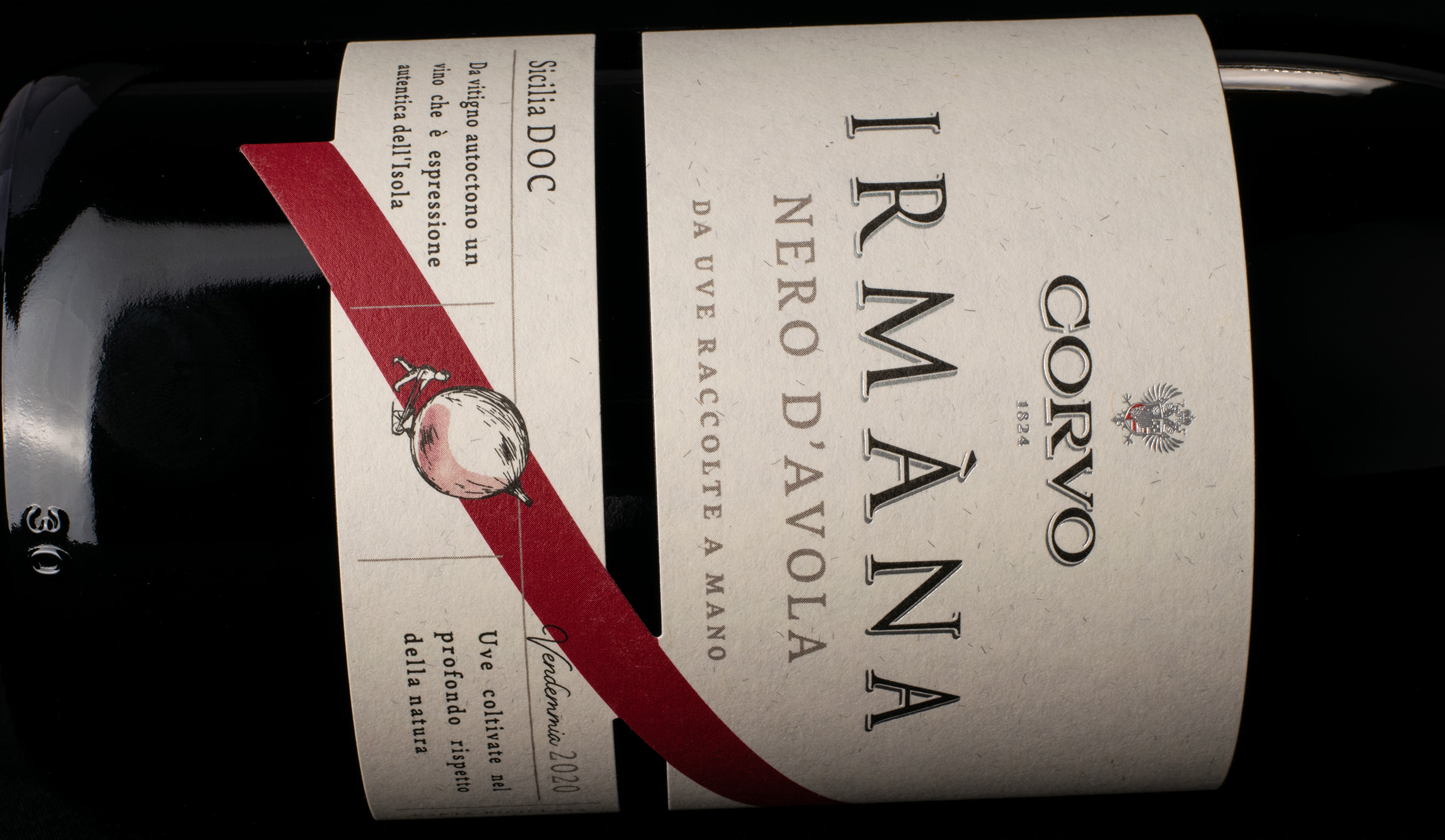
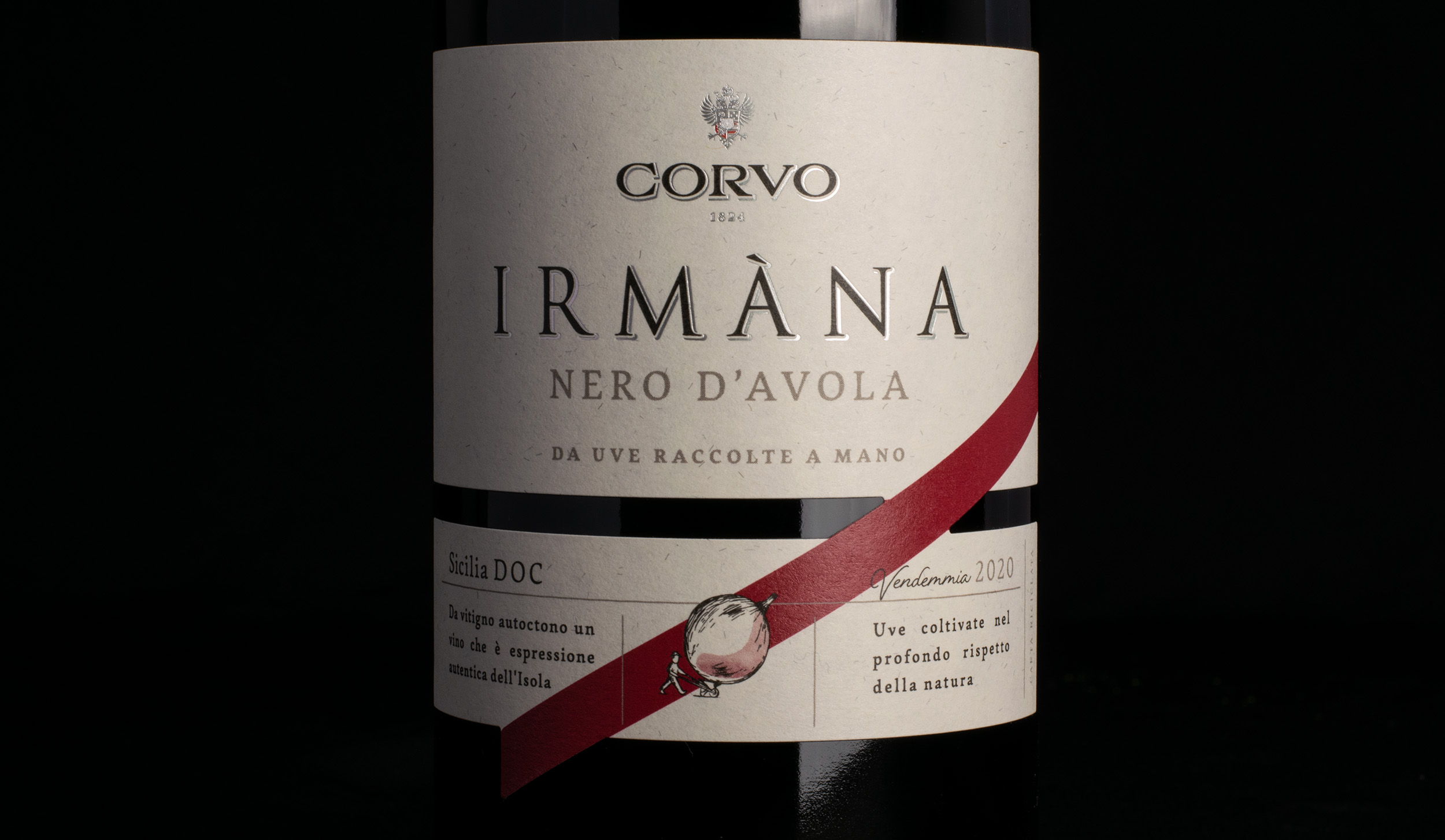
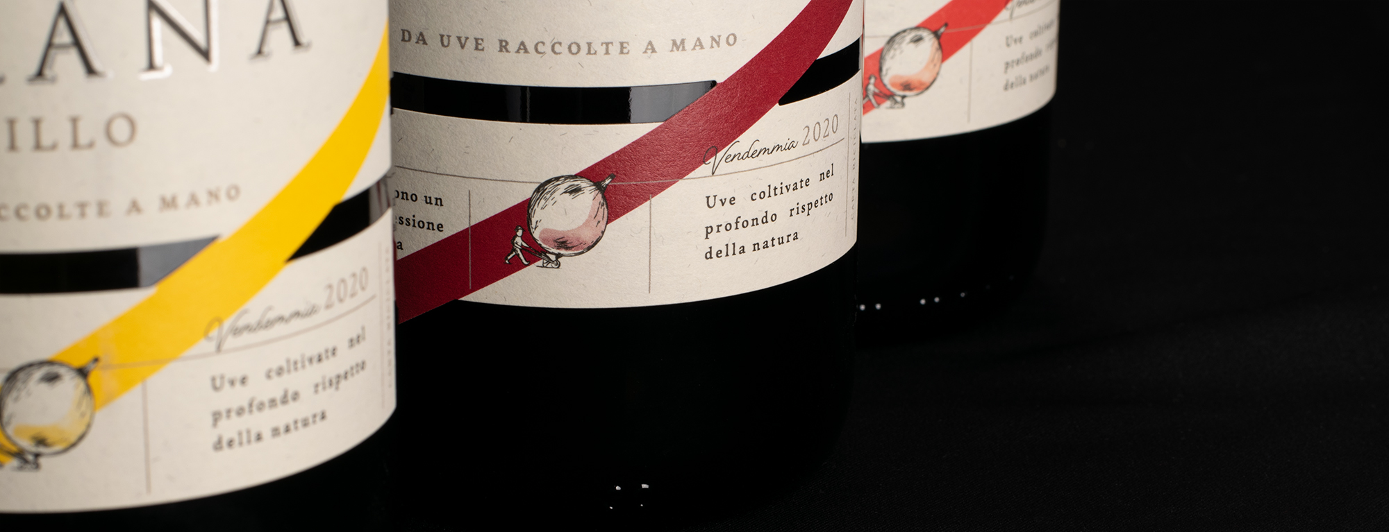
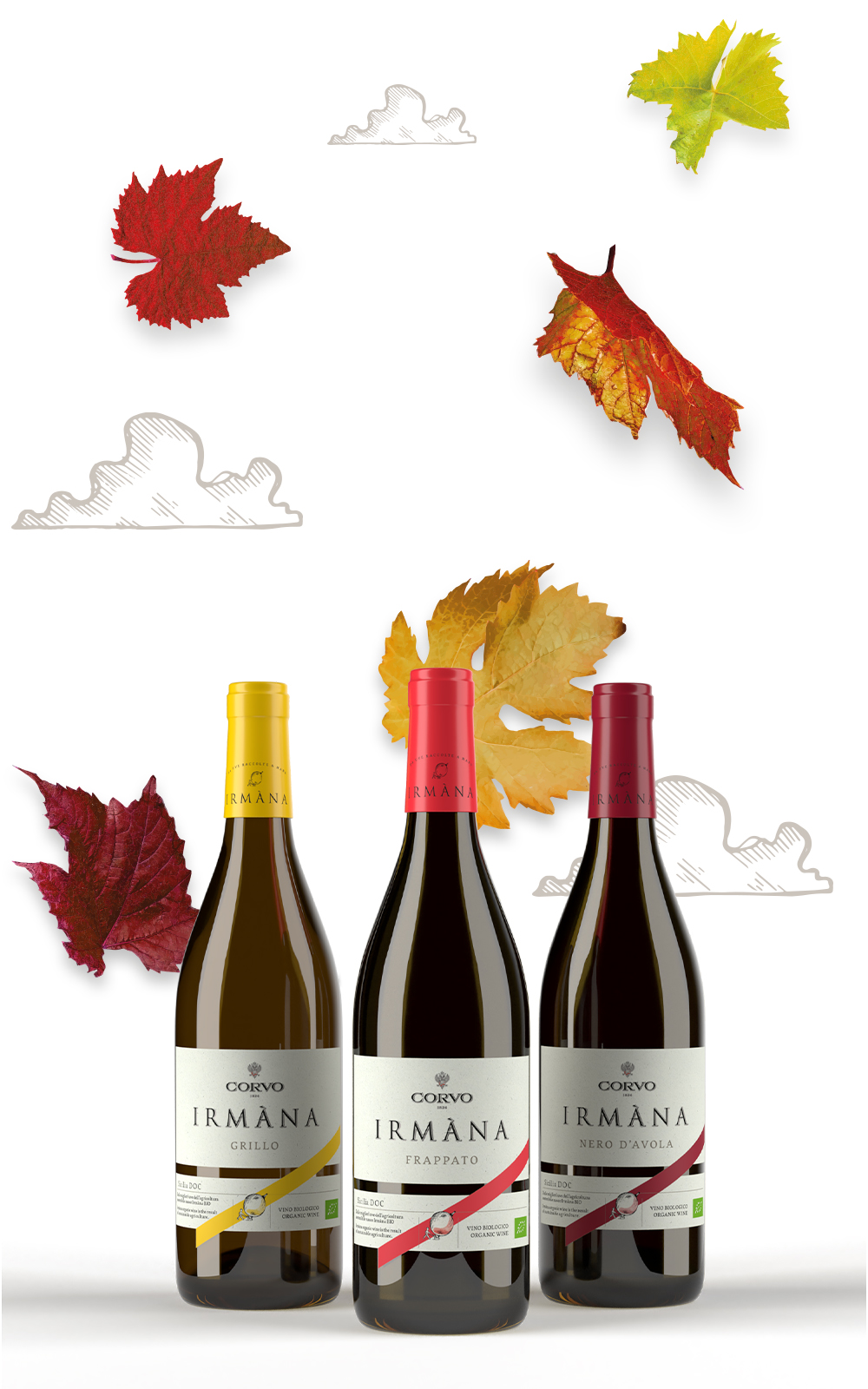
Irmàna wines are comprised of a selection of DOC mono varietals under the Corvo Brand. We adapted the graphic “sash” of the Corvo mother brand to this unique almost bikini style label design.
We not only created a Brand Guide for the declination of the Irmàna brand, accompanied by a hand-drawn alphabet of icons to use on communications, promotions and special packaging, we also studied an organic language comprised of autumn leaves (the natural time of harvesting the grapes) to accompany the promotions. Beyond the visual language, we also chose a recycled paper material for the label.

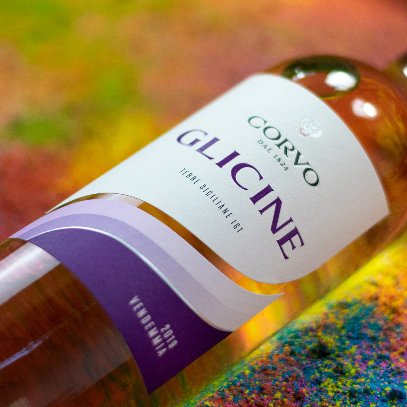
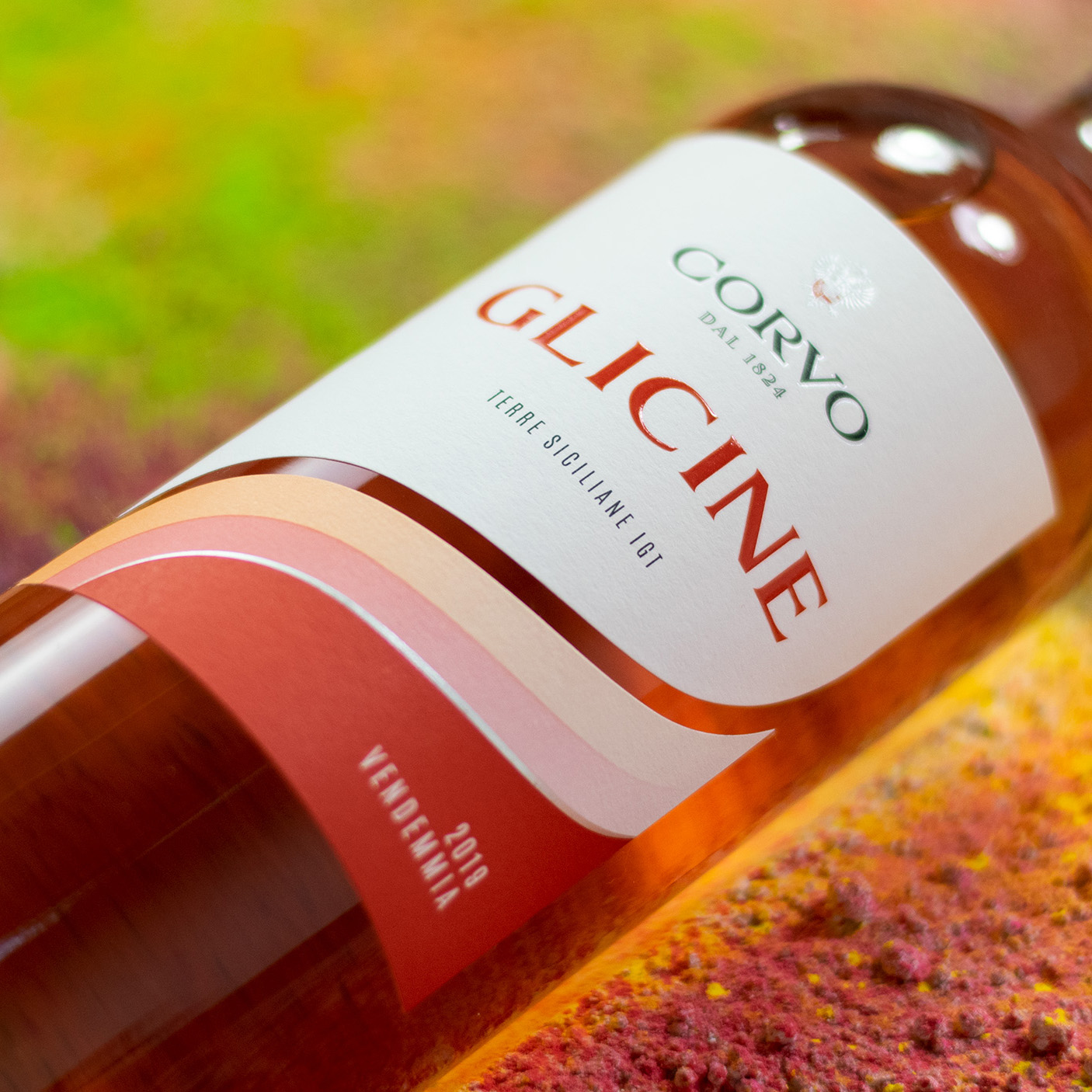
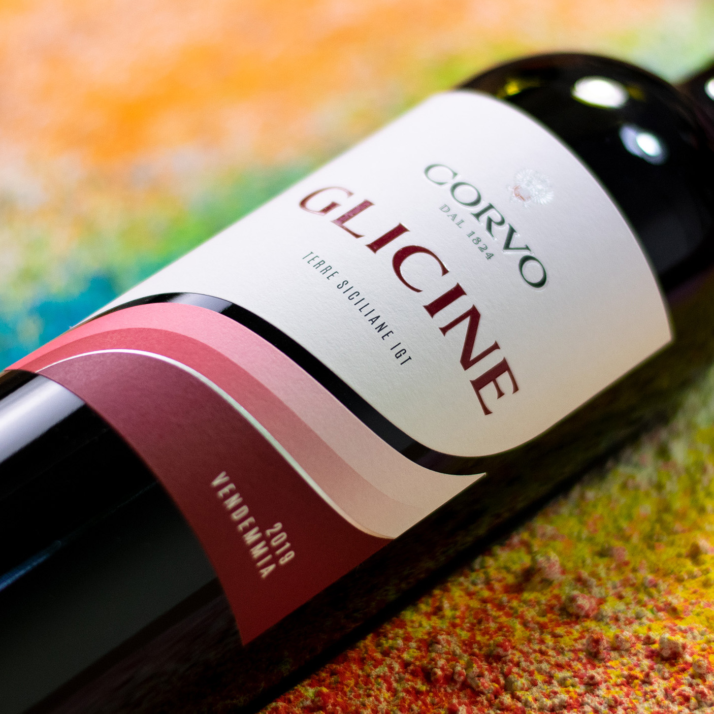
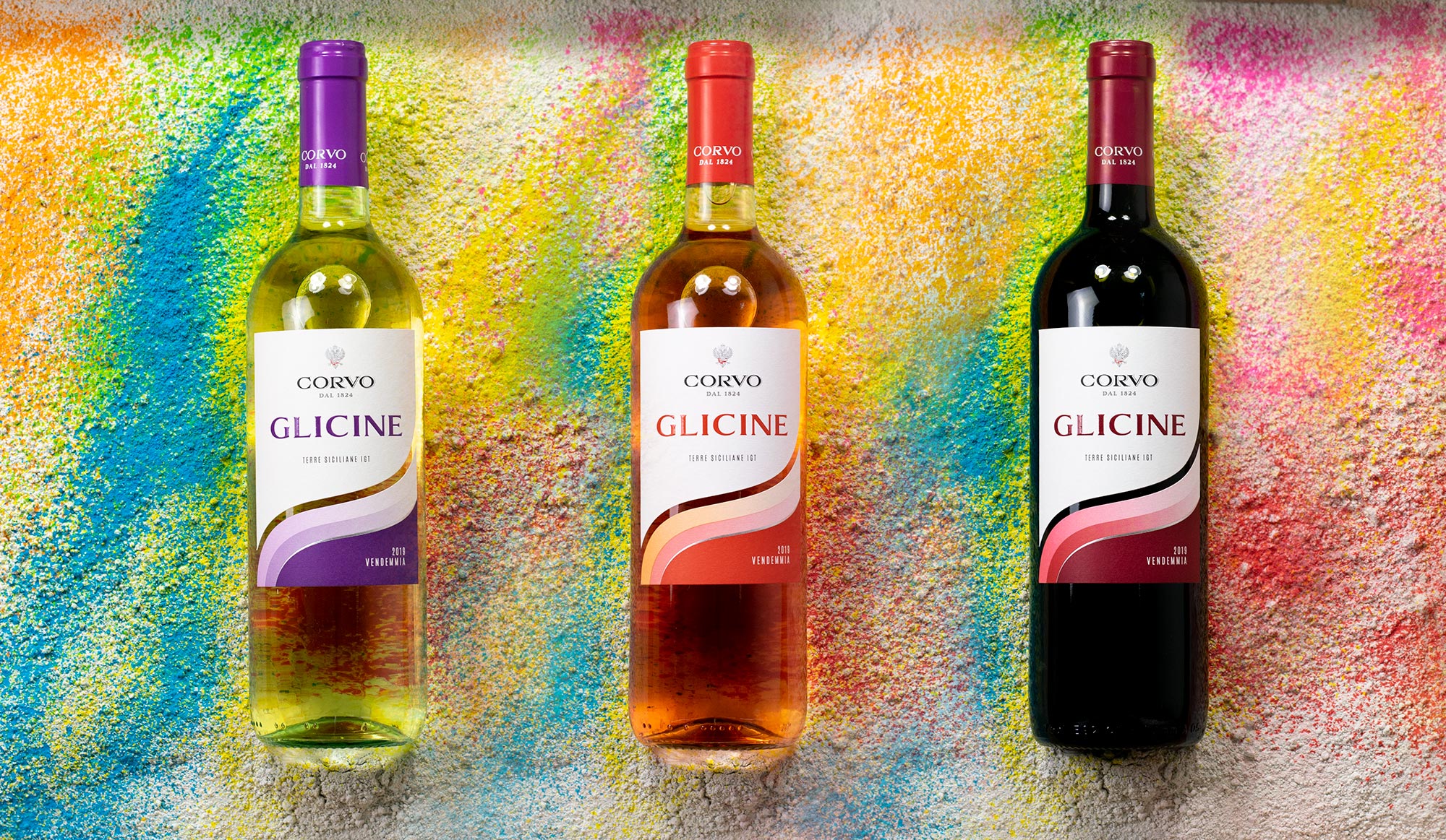
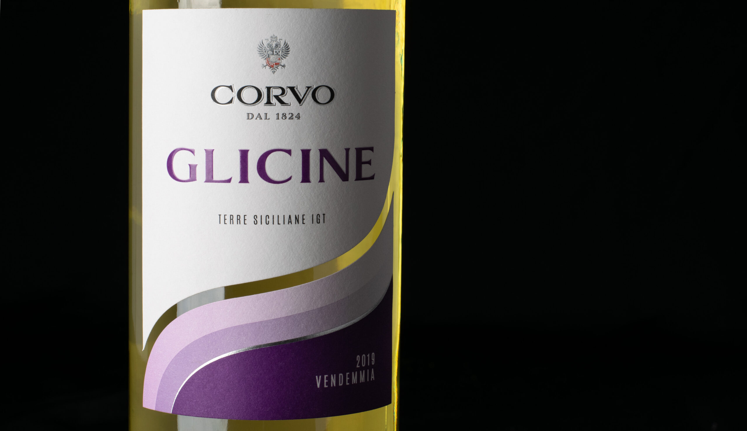
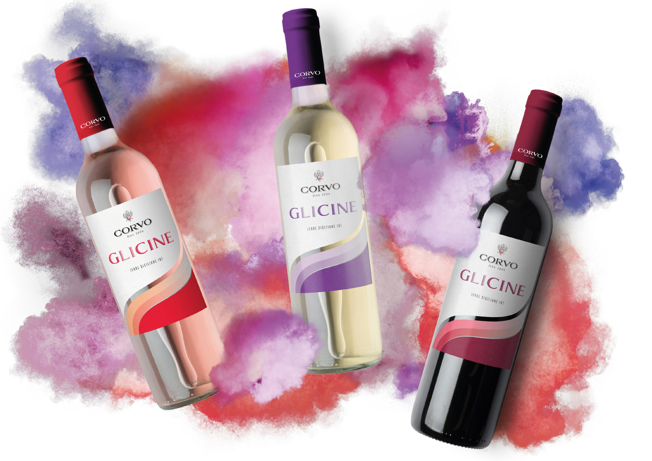
Glicine is the Corvo line dedicated to a younger market. The brand maintains the traditional touch of the Corvo Winery Brand where the “sash” takes on a free, fluid movement, highlighted by bright spring colors. The original purple reflects the name of this brand “Glicine” which translates to wisteria the purple flowers native to most parts of Italy.
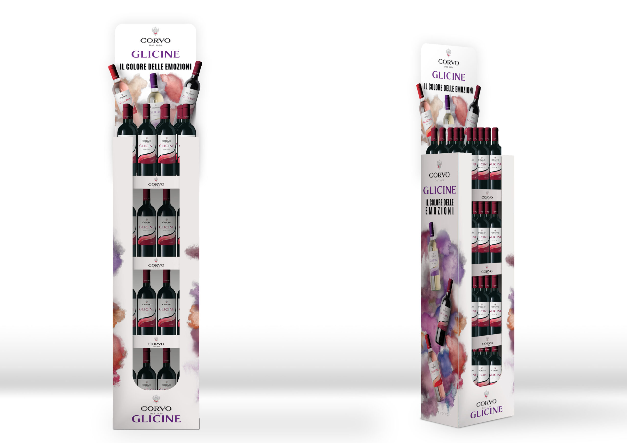
The declination of the Glicine brand for in store promotions and flyers is dressed with bright pops of festive color.
